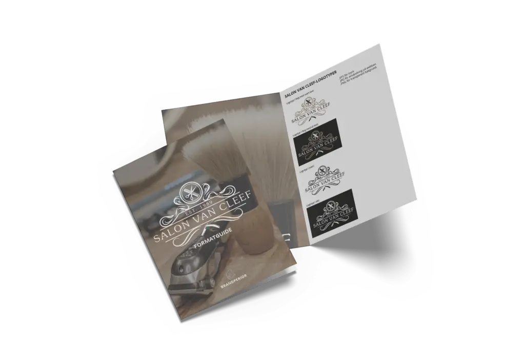
The wish from Andreas Sjöberg, who is the owner of the centrally situated hair salon in Ulricehamn since 2018, was a logotype to provide the sense of a classic salon style with a certain vintage feeling and preferably with a shaving knife among the details. After a generation shift and change of ownership, it was time for an update and energy boost.
Brandperior Loves Creating Logotypes
At Brandperior, we were proud of the assignment. There is a passion for these kinds of assignments where we can be creative and adding a little extra spice. The hair salon has a genuine history and is well-known amongst the majority in Ulricehamn since it has been around for more than 35 years.
After further interviews and research, we reached a result both Andreas and we are very satisfied with!
Salon van Cleef’s New Logotype – background and description of the design
The new logotype provides an impression of classical elegance and brings to mind a barber shop and hairdresser with refined taste. The vintage feeling stems from the centrally positioned shaving knife and the curved elements framing the logotype. Scissors and a comb were placed at the top for people to quickly understand what the logotype visualises. The upper part of the design resembles a haircut and the lower part a moustache – a complete gentlemen’s hairstyle if you look at the logotype from a distance. The three colours featuring golden/beige as the obvious accent colour to convey luxury, works seamlessly with the font which is easy to read, and works well for various forms of marketing material such as vinyl print on the large windows facing the street.
The delivery consisted of a graphic manual and the logotype in different colour alternatives and black and white. The formats were of course suited for both web and print.
Does this sound interesting and inspiring? Then read more about Brandperior offerings for The Brand Name, Design and don´t hesitate to contact us.

