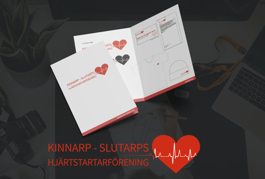
The newly formed association aims to increase the 24/7 availability of AEDs (Automatic External Defibrillators) in Kinnarp and Slutarp, whilst spreading theoretical and practical CPR knowledge. Our collective effort can save lives. The association required a logotype to represent their mission.
A Meaningful Assignment
Brandperior felt honoured to be addressed to create the logotype. We recognise the importance of spread this message and were proud to contribute. The association’s board members came with suggestions for the design, and after a proof reading, we reached a result that everyone were really pleased with.
The AED Association’s Logotype – Design Elements
Incorporating Kinnarp and Slutarp was essential to establish geographical context, alongside the AED Association title. The logotype needed versatility, functioning both as a standalone heart icon and eith accompanying text. Brandperior got beautiful sketches from the association featuring the heart illustration and the text positioning. The red colour was important, and the pattern across the heart symbolising cardiac activity. We supplied the logotype various formats for digital material, and as an icon.
We wish all the best for the association and trust that their work will be appreciated by residents in Kinnarp and Slutarp.
Please read further about our values and how we approach Brand and Design. Don’t hesitate to contact us if you think we can be of help to you.

